Stock Market History Graph
of the Dow Jones Industrial Average (1900-Present)
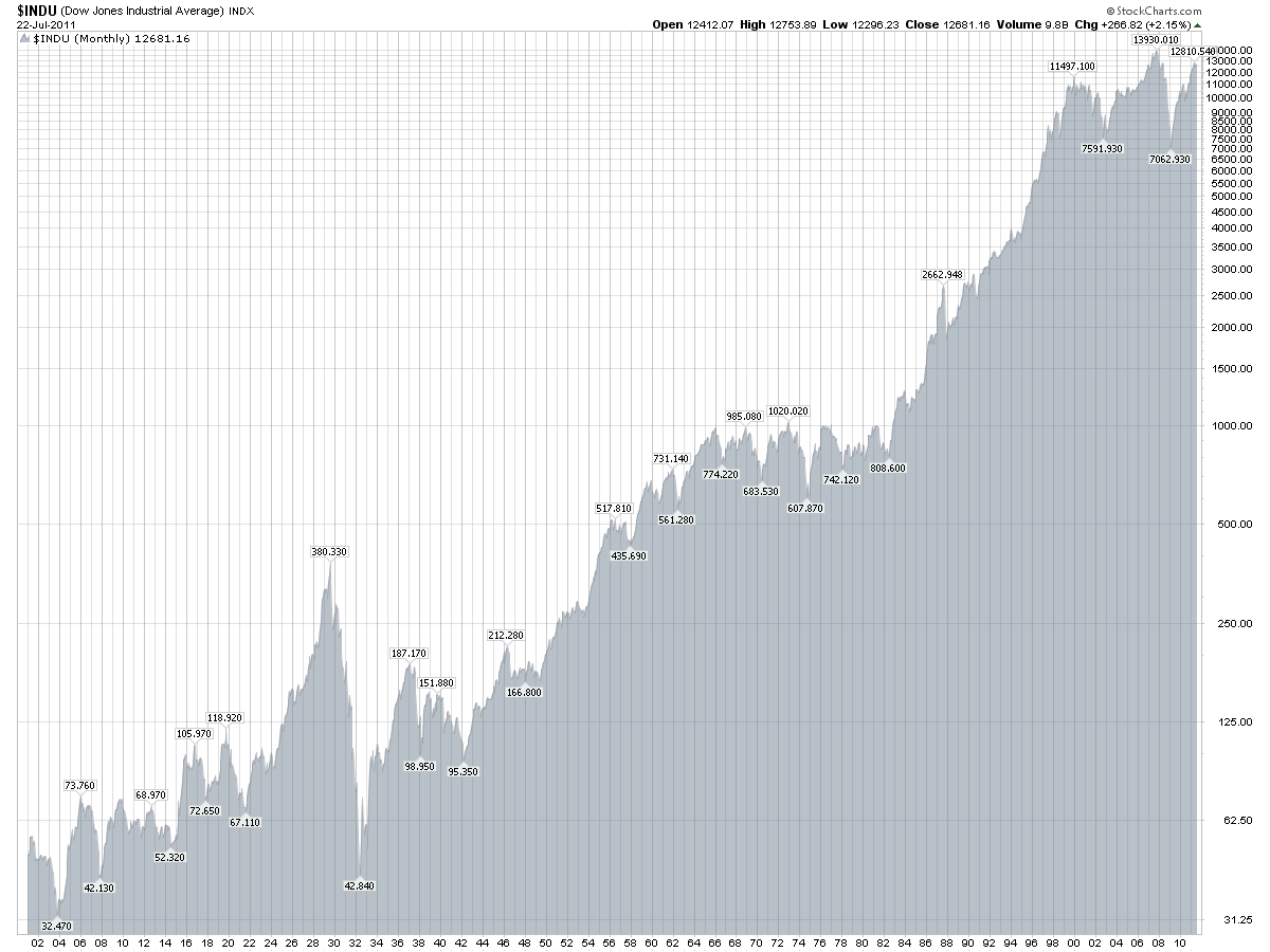
A stock market history graph can really tell a story and this one does. Between the meteoric rise and the dramatic drops of the Dow Joes Industrial Average ($INDU), financial investors dreams and nightmares have all taken place.
Interestingly, the stock market historical data mostly shows how volatile the $INDU was in the early 1900s, but by the 1950s, the market rose nicely with a couple of plateaus along the way. We look to be in one of those plateaus and for as bad as the two big dips have been within the last 10 years, the market is still far above where it was when stock trading began and definitely not as bad as the Wall Street Crash of 1929. By no means is this a claim to stay in the markets even when the trend is down, thinking that it will always eventually rise. Not all stocks traded on the $INDU or other indices will follow the market. Some stocks get flogged and stay flogged. The focus of this website is more risk-adverse, profit-oriented and favors trend trading which can keep investors in the right positions at the right time. There are ways to determine
stock market trend
and create
stock trading systems
that will work in any stock market environment and create stock market success.
Return from
Stock Market History Graph to Stock Trading Warrior Home.
Want to take charge of your stock trading?
Try a subscription to the free monthly newsletter - What's New at Stock Trading Warrior. Just sign up below and enjoy!
|


